Product Designer - UX-UI Designer
Oct 2022 - Feb 2023 (4.5 month)

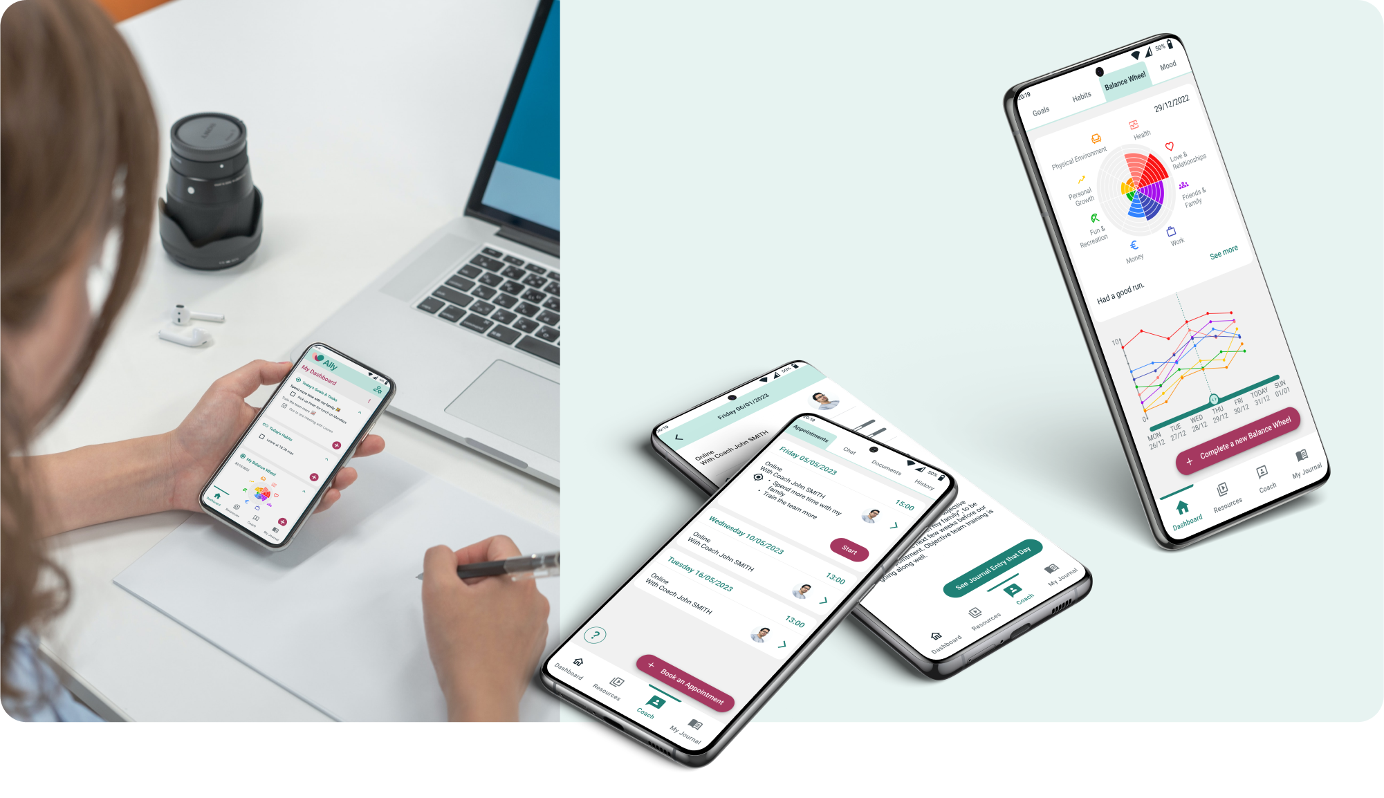
Ally is a concept product that employers can offer to their employees to help them reach a better work-life balance. It gives the users access to a personal coach and to tools that can be tailored to their needs.
Stress affects employees, but can also cause issues for employers by leading to:
After a competitive analysis and some user research, I stopped to think about what could differentiate Ally from the existing stress-relief tools - what could bring the most value to users?
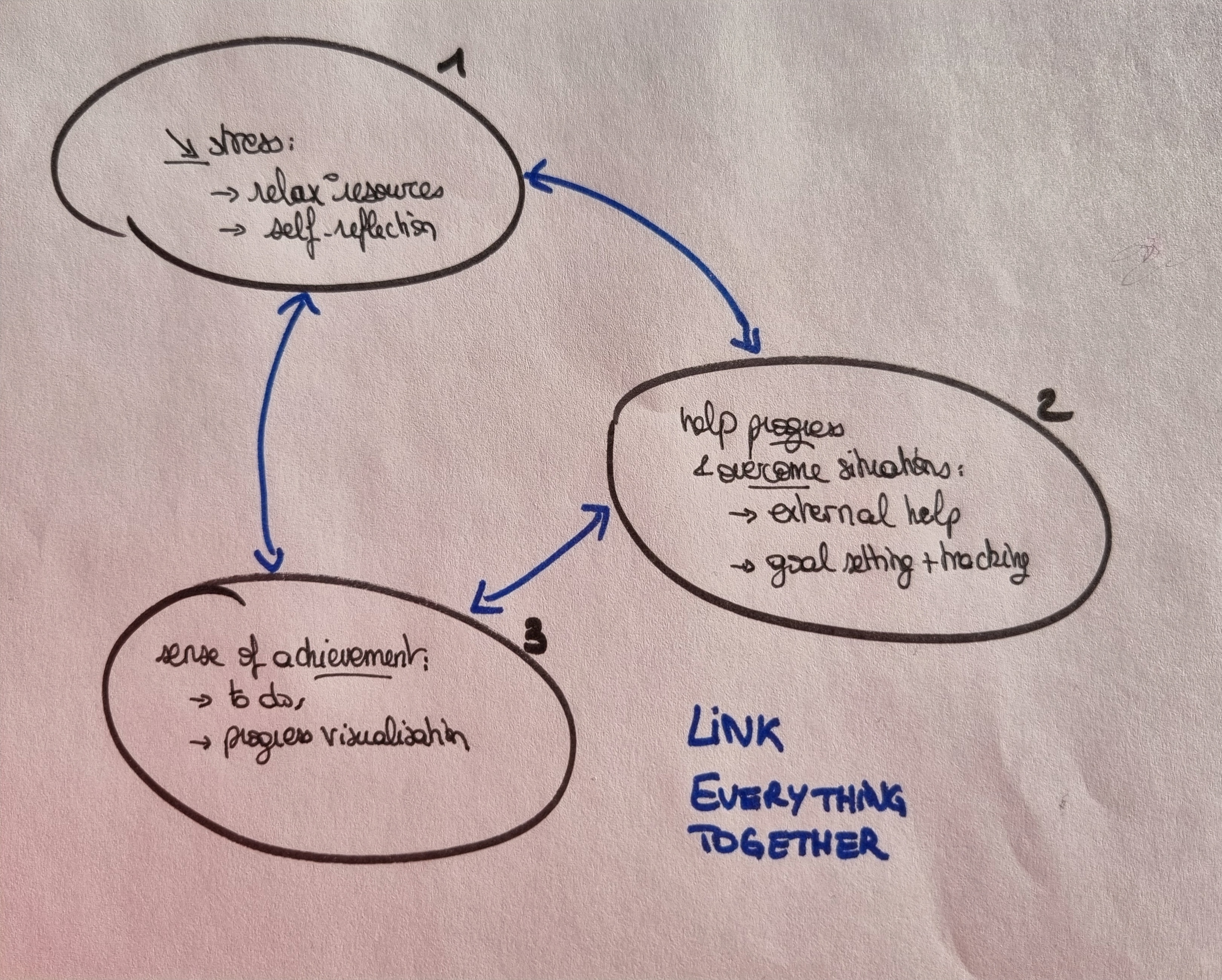
Rather than isolated tools, I designed a holistic support system, combining and linking together a selection of effective exercises as well as coaching sessions.
Following the research phase I focused on the architecture of the product and on streamlining the numerous processes of the application, using:

Interconnections between features

User flow for Julia, the workaholic persona, to book an appointment with a coach

Coach feature, from hand-drawn wireframes to mid-fidelity prototype
I then conducted a usability test and iterated on this process several times before moving on to designing the visual identity and UI of the product.
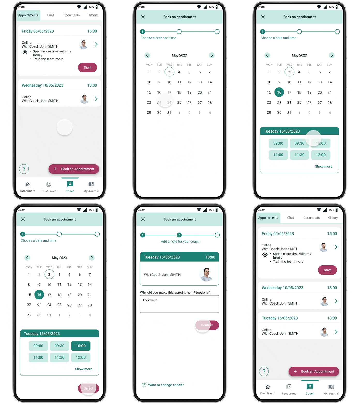
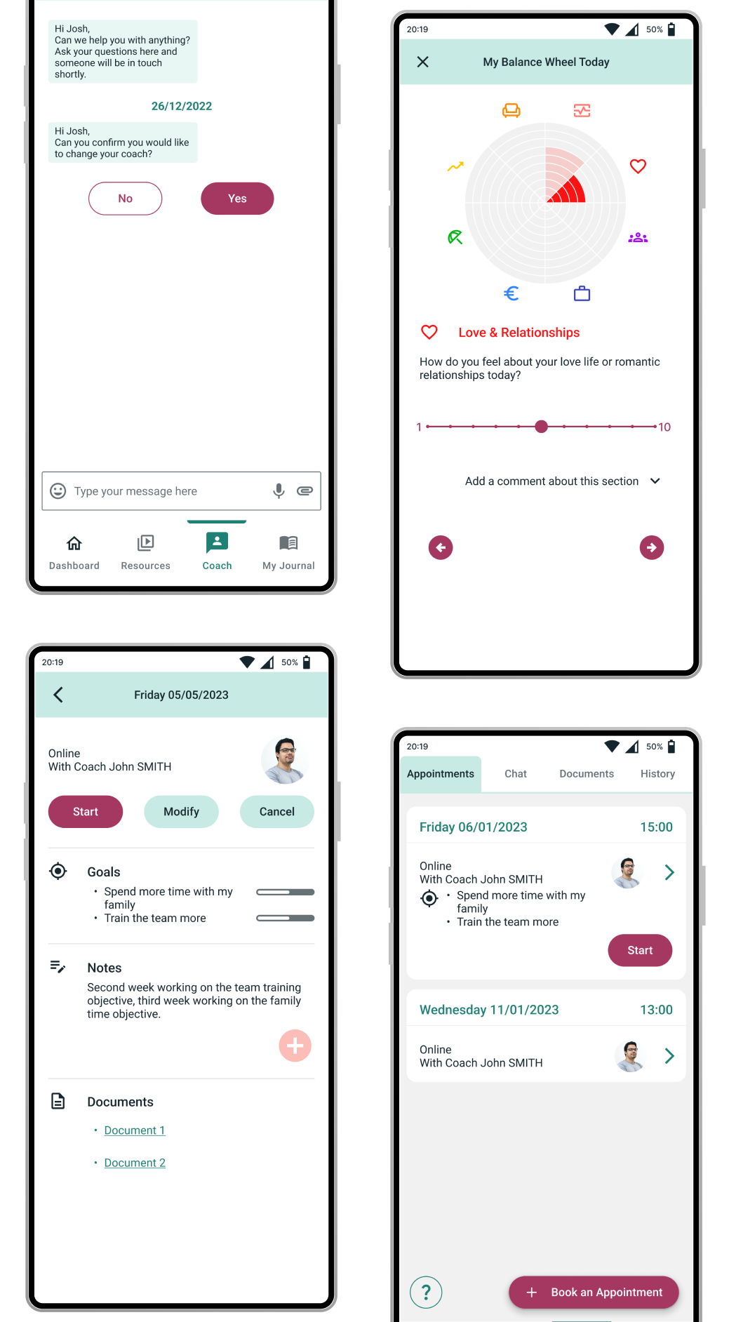
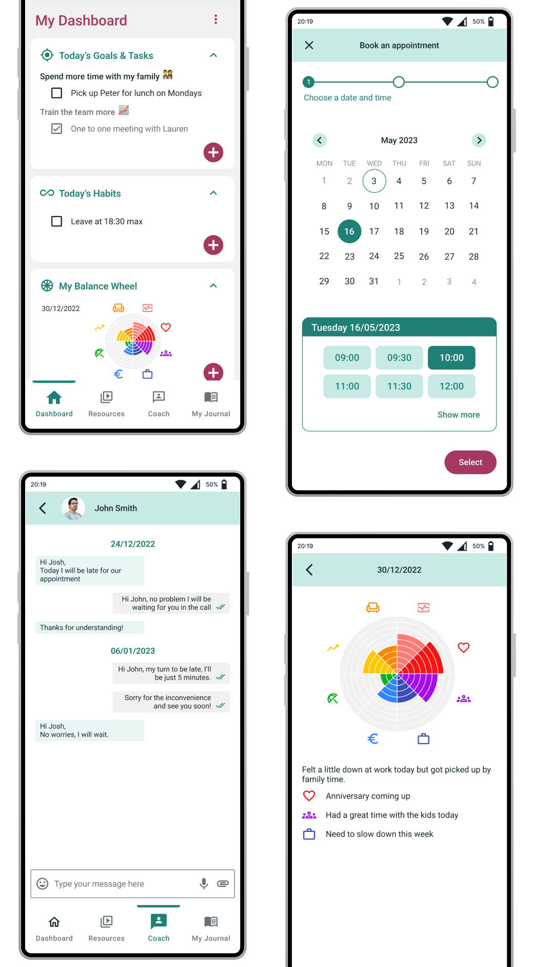
Coach feature, high-fidelity prototype
Ally is a combination of various interconnected features, among which are complex ones.
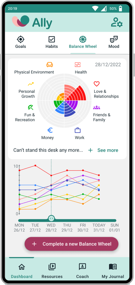
Meet my nemesis: the Balance Wheel feature.
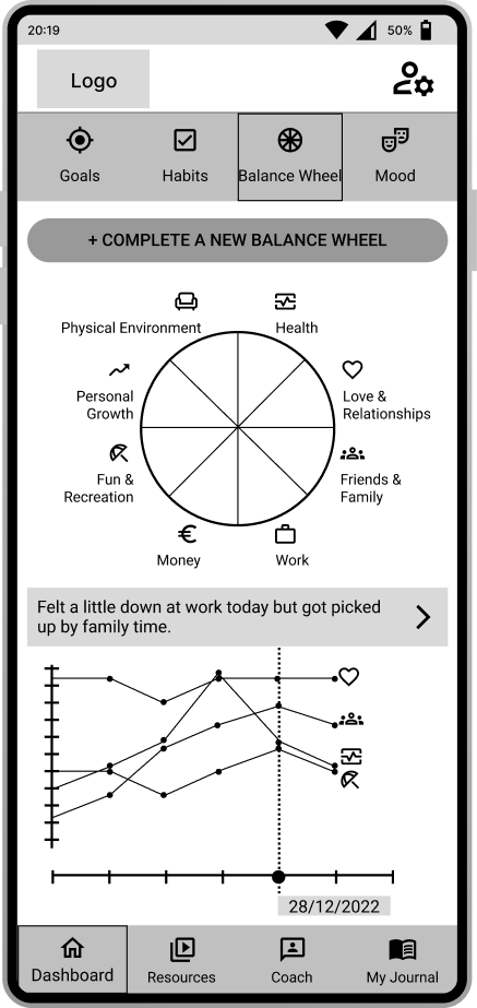
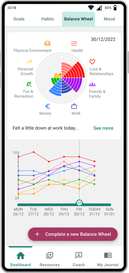
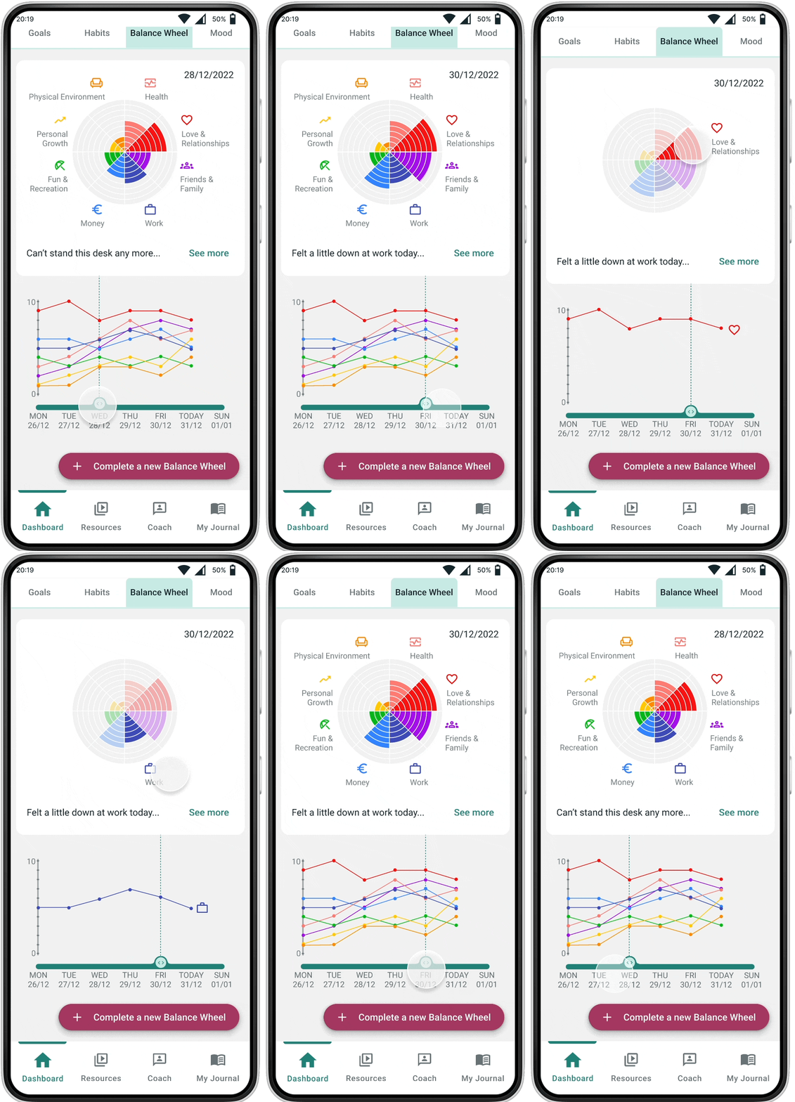
A usability test showed that the Balance Wheel screens I had first designed were too crowded and unclear. While removing no content, I needed to make the screen:
The Balance Wheel is an exercise for users to regularly rate and acknowledge how they feel about various aspects of their lives (health, love life, work...). In this feature they can:
Iterations on the Balance Wheel section screen
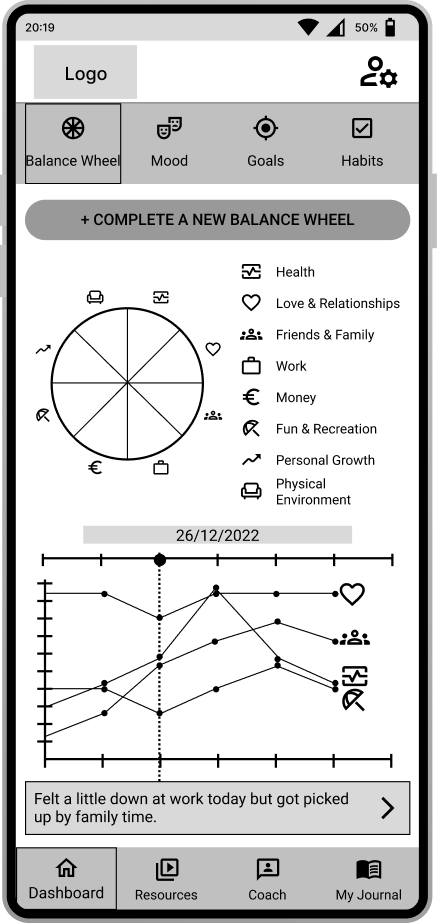
Initial wireframe
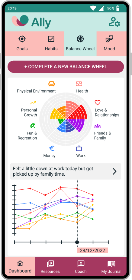
Adding colour:
Ally is now on its way to becoming a useful, holistic solution for a variety of employees to use, helping them feel good and find the right work-life balance.
The development of the Personal Coach and the Balance Wheel features allowed me to validate the principle of the product and to understand how users will interact with it.
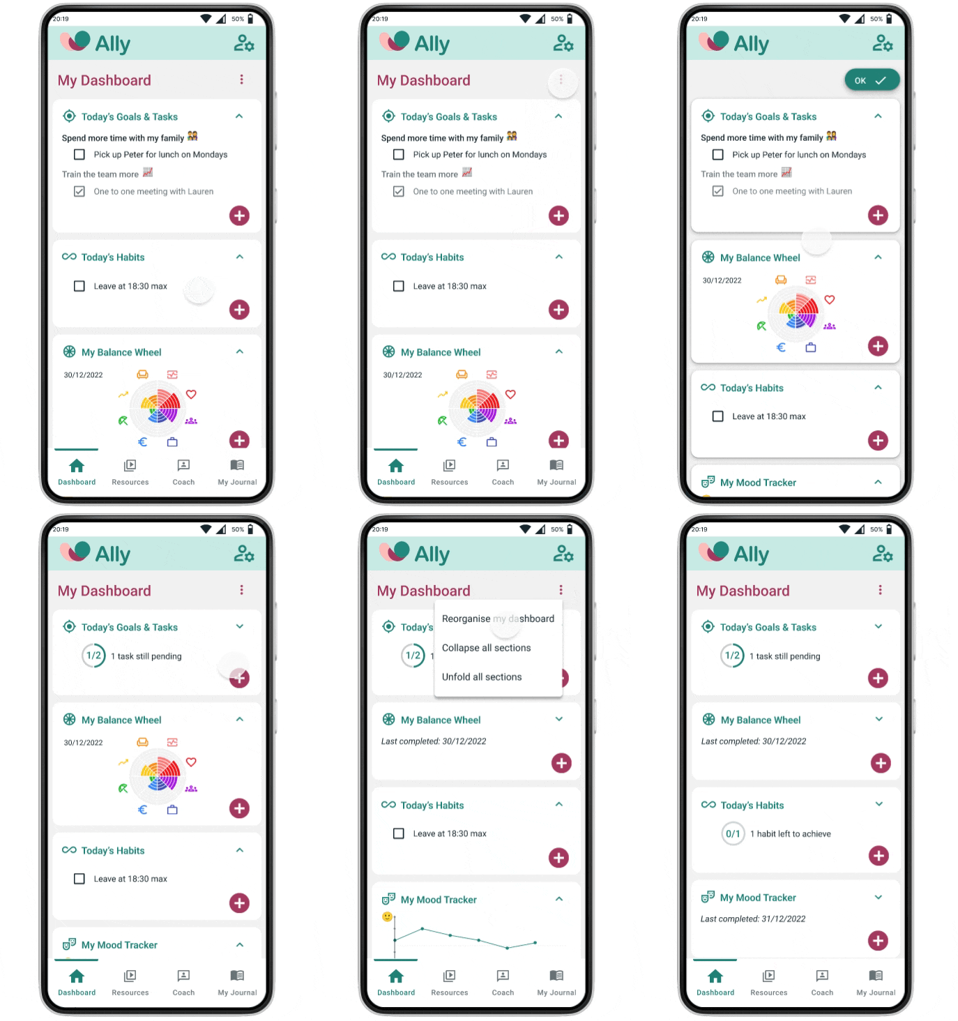
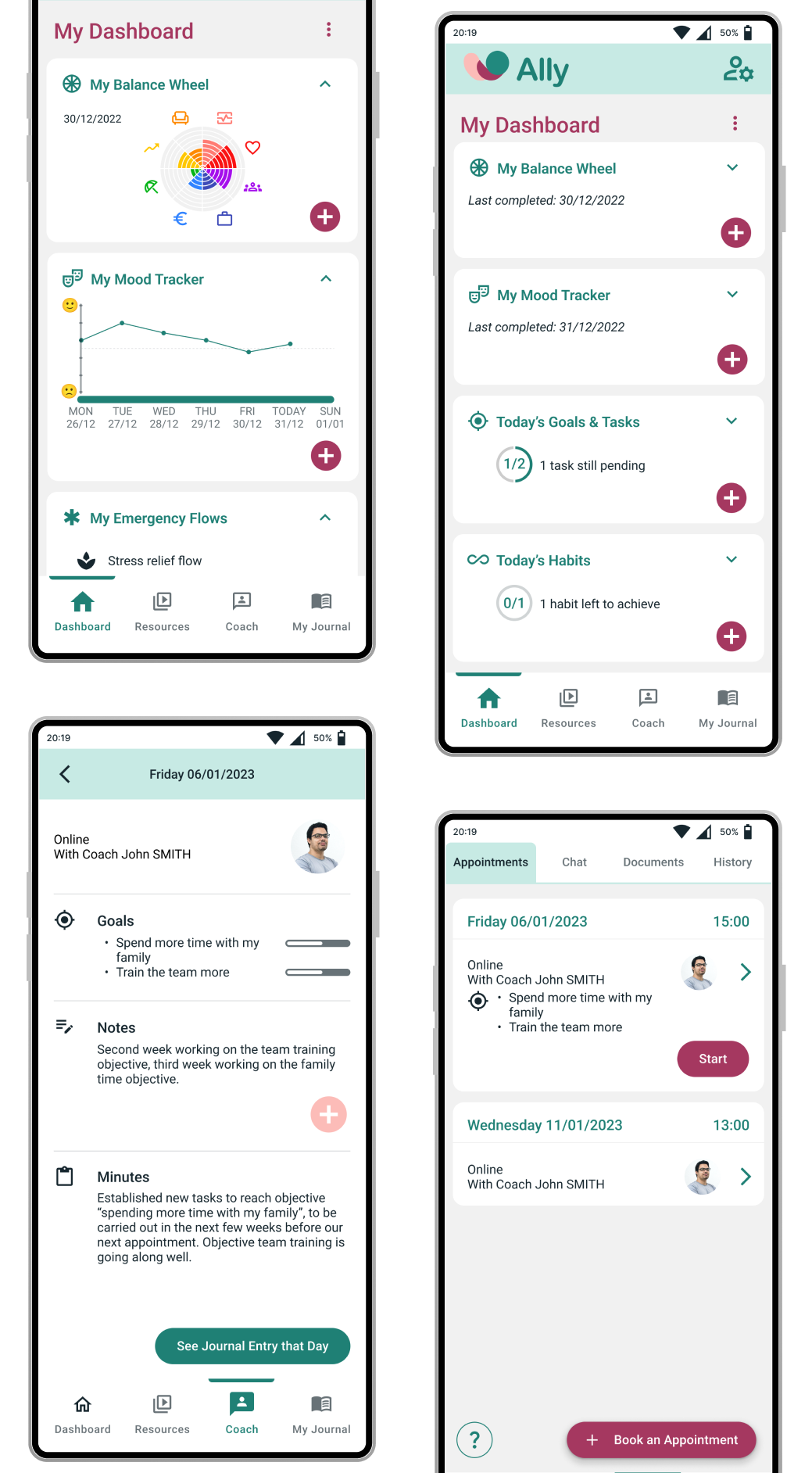
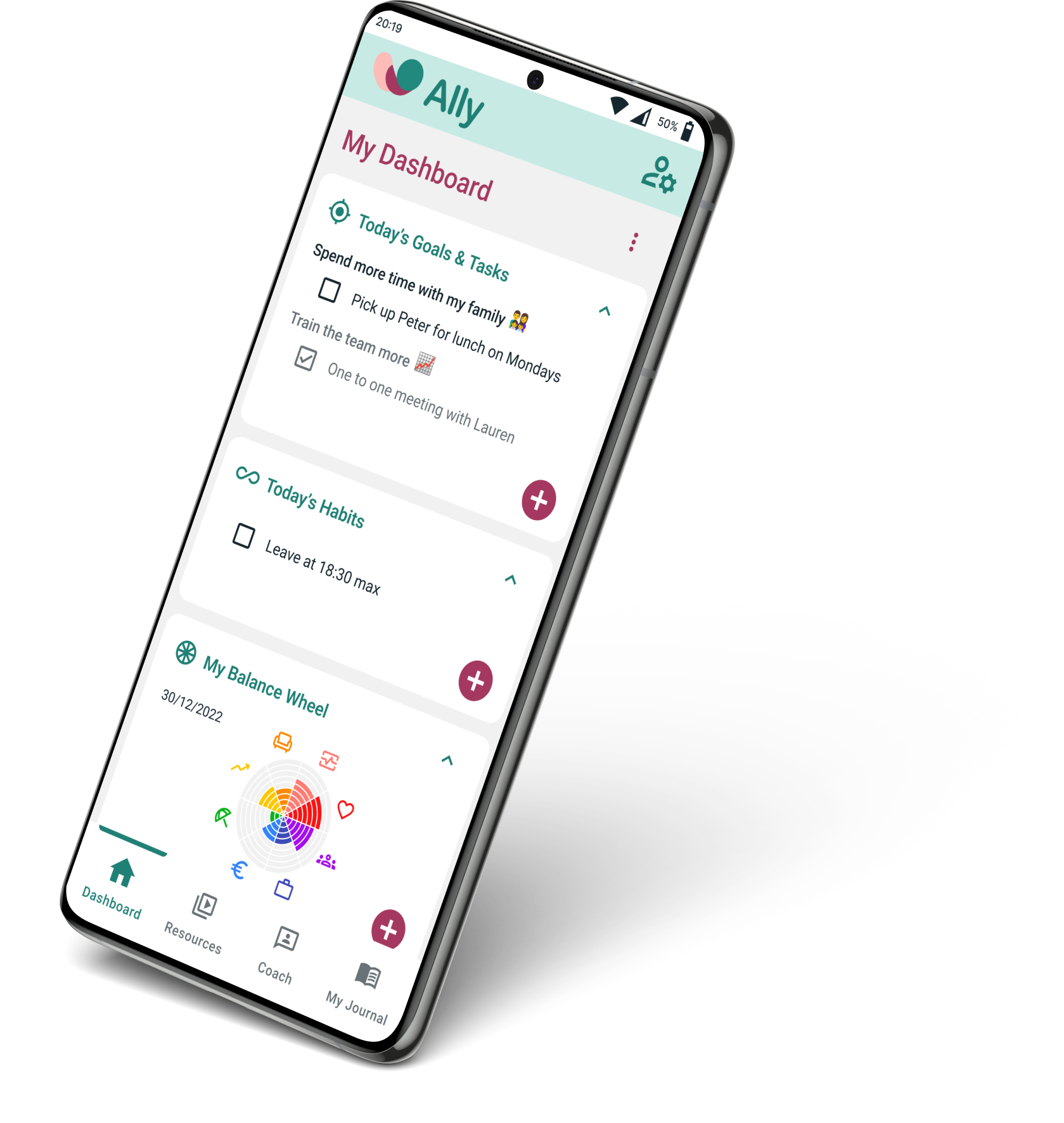
I also designed a Dashboard feature to give users a customisable overview of their situation and of the available options to help them.
With those 3 key features, I developed a framework for simple navigation, easy and pleasant use, and systematic connections between resources.
