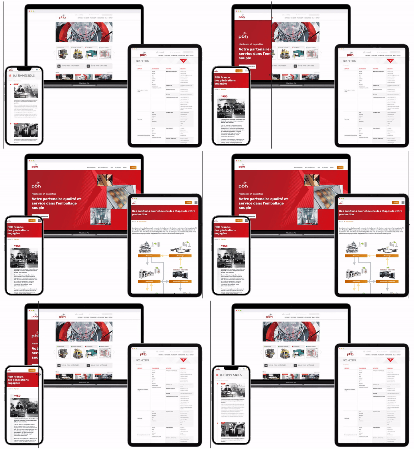
UX Designer - UI Designer
Feb-May 2024 (3.5 month)
PBH France is a family-run company selling and servicing premium machinery and equipment for the printing and transformation of paper and soft packaging.

I was initially hired to give a new face to the company’s website (UI) and create a new page presenting the various categories of products offered by PBH France. Along the way, the mission was extended to also restructure the news section, which was “underused” or maybe even misused in the eye of the president of PBH.
PBH France had identified that they needed to restructure their products into clear categories and subcategories. And now their president was pointing out that they could do better use of their news articles. They did invest time publishing quality texts at least once a month and then communicating about it on social media. Visitors came to read the article, however they did not go on to visit the rest of the website, especially product pages. All pointed towards an architecture problem.
I had a long hard look at the website, the data collected via Google Analytics, the current user flows and how visitors use the News section of the PBH website.
In short:
Website content divided in 4 silos:
Strong entry points to the website:
Clarity issues:
Dead end navigation:
Two major problems arose:
With the help of PBH, I reorganised the products into exclusive categories and subcategories to get a clear, understandable structure of the offer.
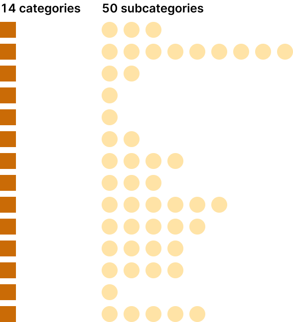
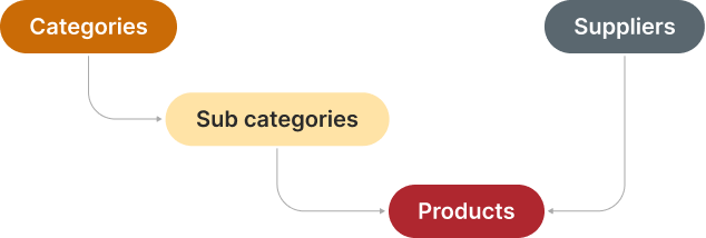
Potential clients now have two possible paths to the product they need: through suppliers or through product categories.
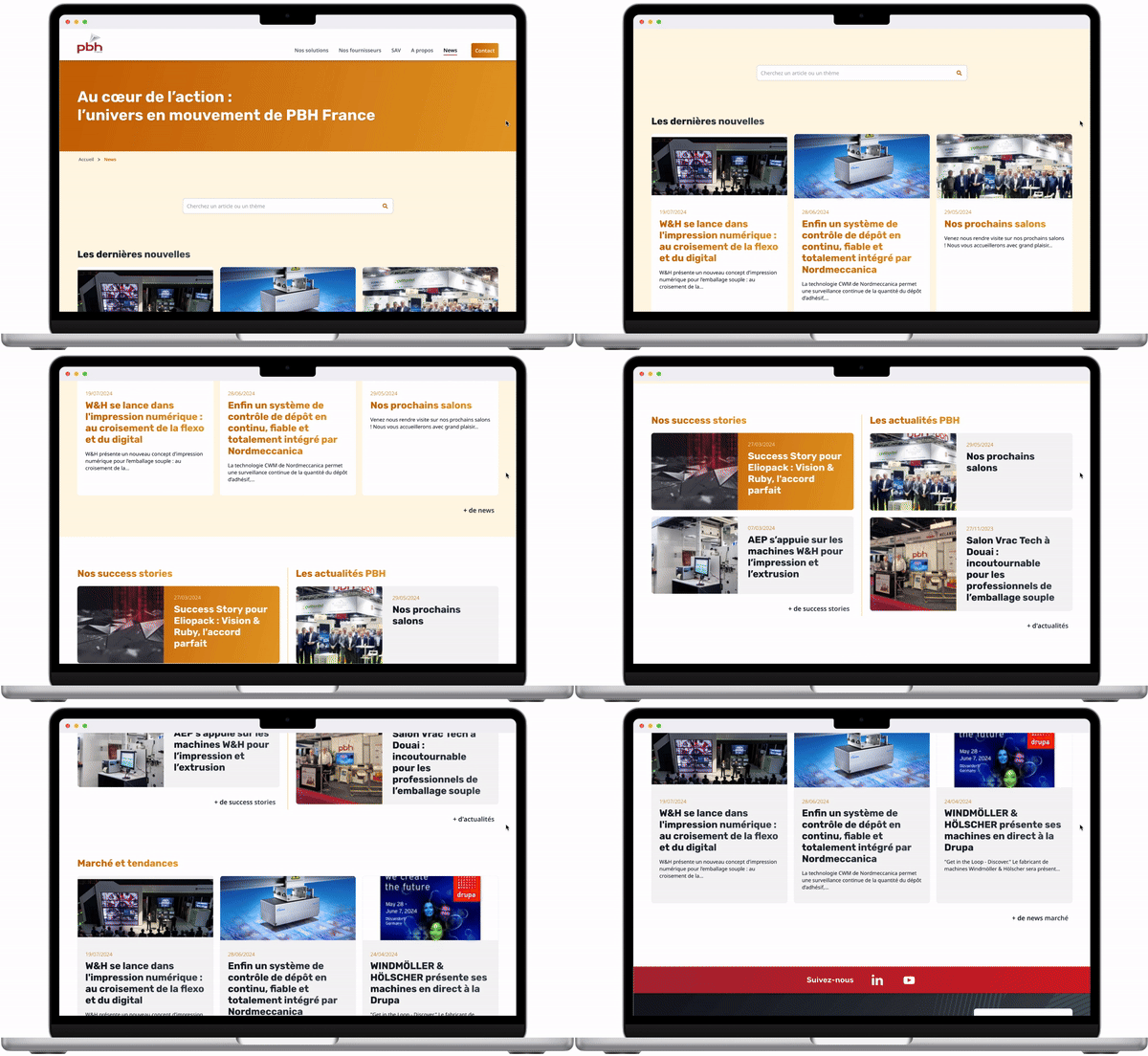
Previous categories for news articles were not exclusive and very much centered on internal concepts (clients, partners, videos…), suggesting nothing about their content. Users couldn’t know what to expect.
I designed new, informative and less numerous categories revolving around content for more transparency:
Temporality being an important component of PBH news pieces, I also redesigned the news page to show both the latest news and the new categories.
To boost engagement and help with SEO, I used the new information architecture to create networks of pages on related topics throughout the website. This allows PBH to automatically push relevant content on existing pages by encouraging visitors entering through one silo to jump to the next.

For example, I designed a renewed article template to redirect traffic from news articles (usually captured on social media) to commercial activity - product and supplier pages.
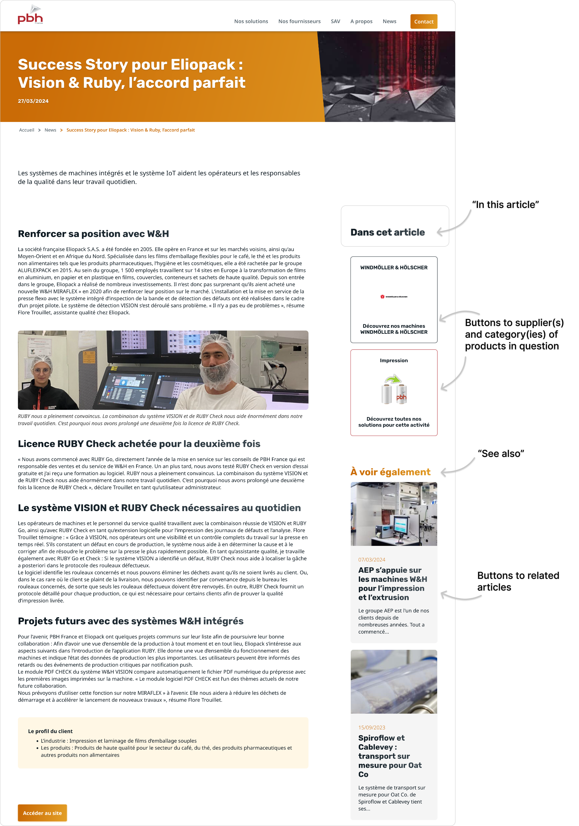
I also used articles to enrich the website’s content and experience by referring to relevant articles on supplier and product pages (about this supplier, about this category).
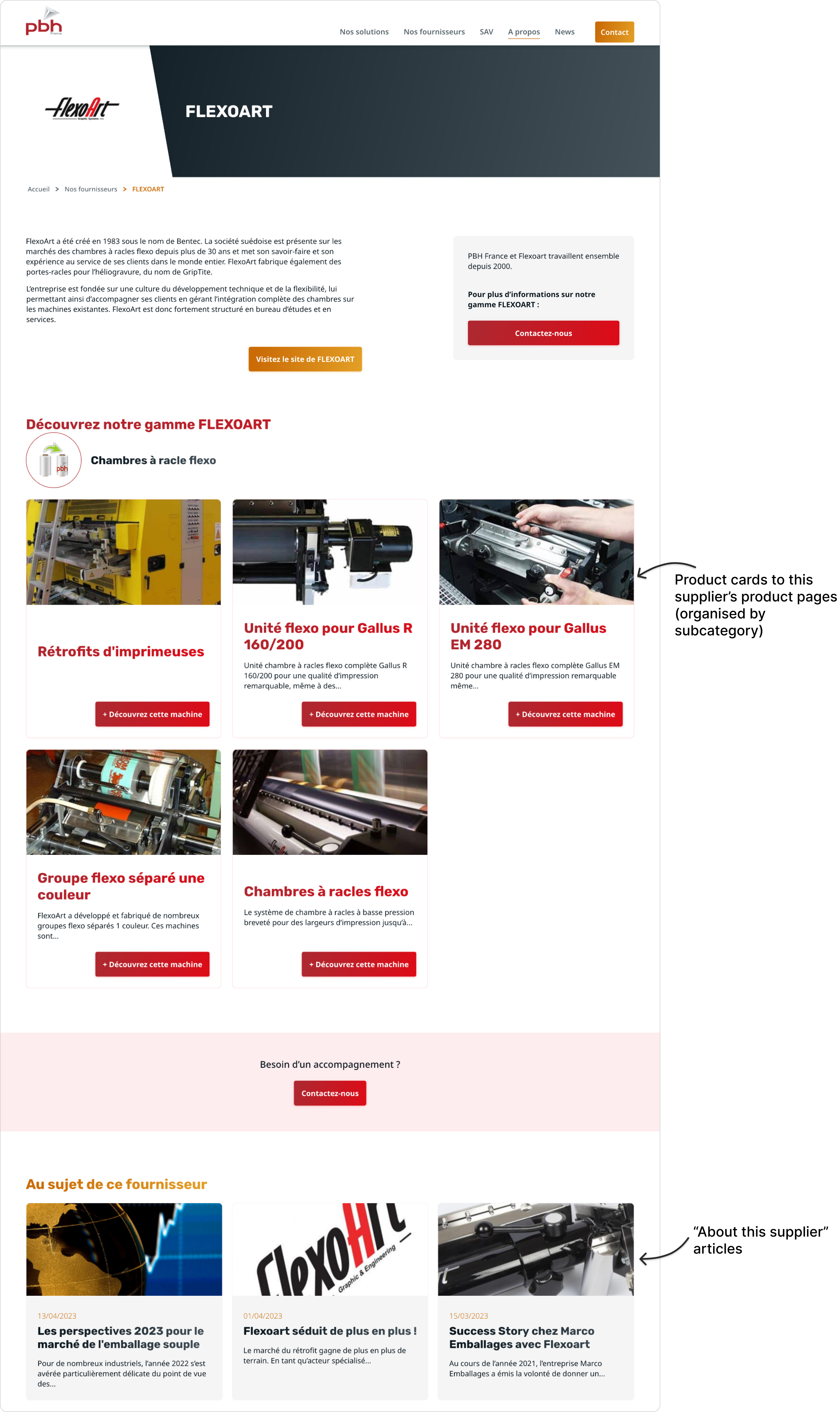
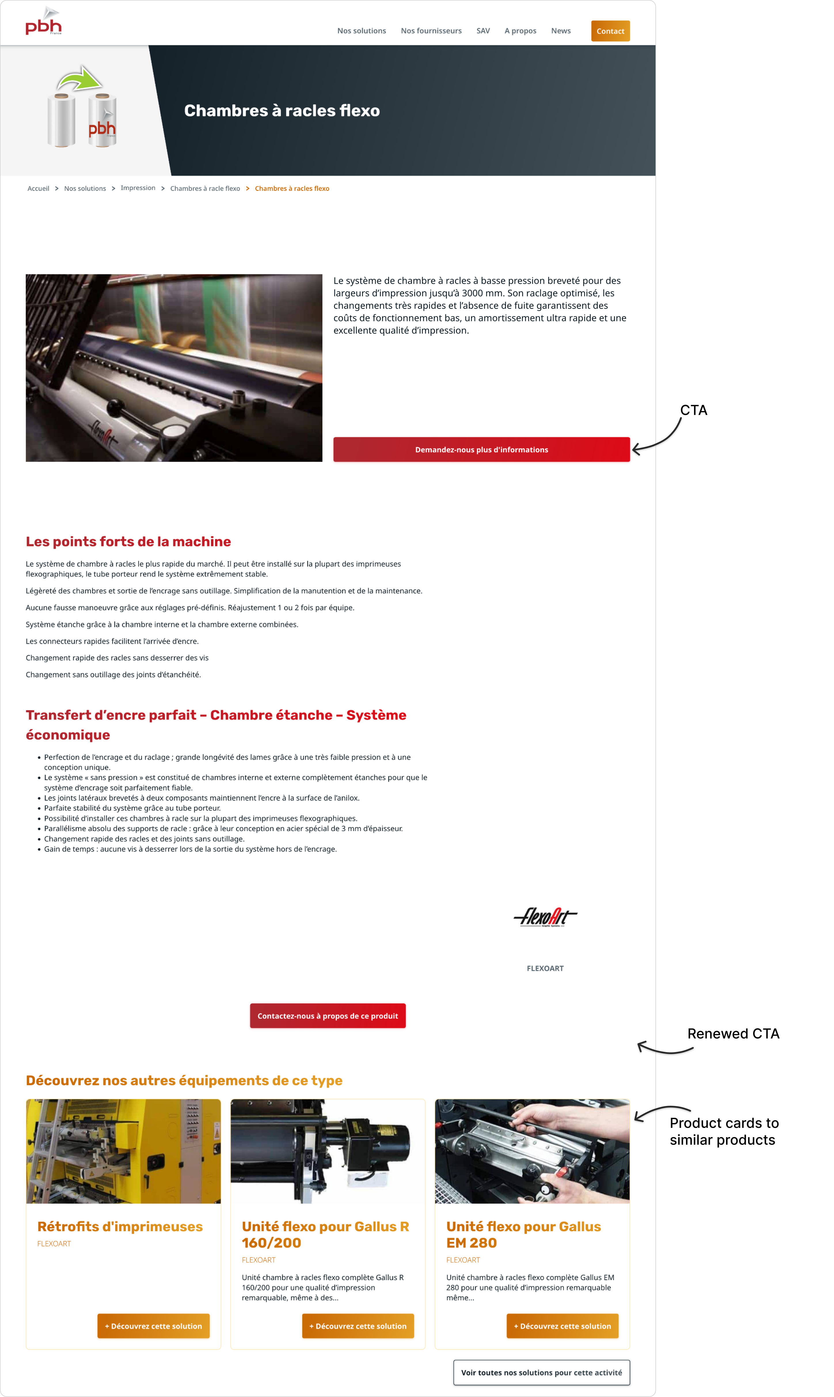
All pages that were dead ends, or even redirecting visitors outside of the website (such as product pages), were redesigned, adding:
All is set to keep the user interested and lead them to contact PBH for business.
This display of additional information is dynamic so that the client has nothing to take care of once basic category information are filled in.
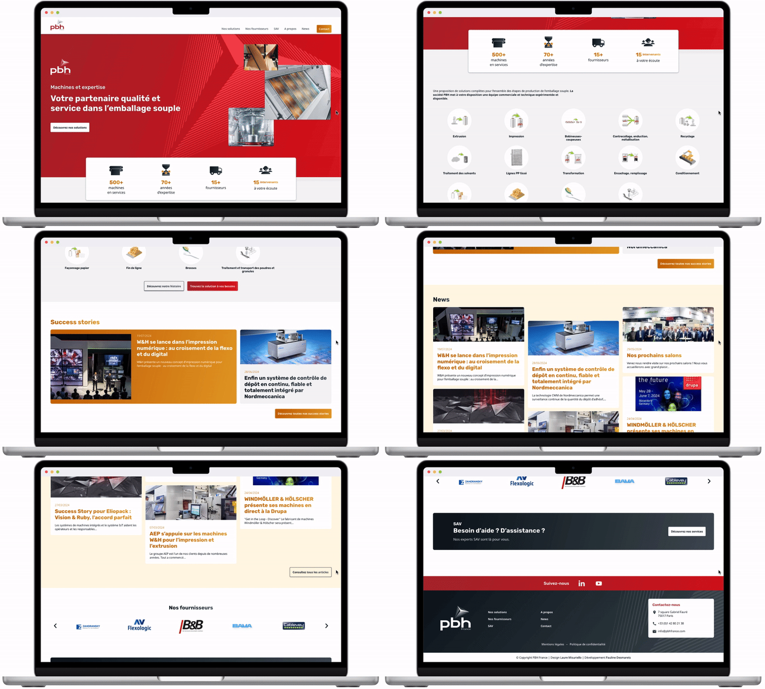
I wrapped this architecture redesign with a complete new UI. I used a neutral colour scheme for a modern and corporate feel, contrasted by a declination of PBH’s signature red as well as strikes of gold. Those two colours draw attention to key elements and align with the company’s branding and values, bringing a sense of quality and warmth to the design of this successful family-owned business.
The homepage features a straightforward layout with large images and clear sections, making it easy to navigate. I opted for a minimal and functional approach to the iconography, ensuring that the hero shots of the products and article covers remain the focal point.
All the interfaces and components are designed for both desktop and mobile to ensure a perfect user experience across all resolutions and media.
The redesign of PBH France's website resulted in improved user engagement, with longer sessions, and overall better user experience and website performance.
The implementation of the new information architecture has enhanced the navigation flow. Users are now more likely to visit multiple pages and make inquiries. The creation of a strategic internal linking network and the restructuring of product categories and news articles also had a positive impact on SEO.
This project challenged me to build a complex architecture including interconnected, dynamic data with strong technical constraints from WordPress. It was interesting for me to work along the developer for this project on how to get the most accurate and relevant suggestions for further content with very limited options to build a database. I am proud to say we managed to build a strong structure while also keeping it simple for the client to manage.